Powerful data visualization for
modern
applications
Turn complex data into clear, interactive and beautiful visual experiences. FusionCharts helps development teams create interactive charts, dashboards, and reporting interfaces faster and with complete control.
Build smarter interfaces.
Ship faster.
Scale with confidence.
FusionCharts gives developers the power to transform raw data into meaningful visuals fast, whether you need simple reporting charts or complex dashboards.
100+ chart types covering every major visualization need.
Framework-agnostic
Use with JavaScript, React, Angular, Vue, Ember, Svelte, and more.
Customizable
Highly customizable visuals via config and API hooks.
Responsive & Interactive
Responsive, interactive, and accessible across devices and browsers.
HTML5/SVG
FusionCharts renders using HTML5/SVG for high-fidelity and cross-platform support, ensuring charts look and behave consistently in modern applications.
One License.
Endless Possibilities.
FusionCharts powers a wide range of real-world business applications.

Executive & operational
dashboards
Visualize KPIs, trends, forecasts, and performance metrics with interactive, multi-series and combination charts.

Business intelligence
& reporting tools
Build embedded analytics with drill-downs, comparisons, annotations and exportable visual reports.

Financial &
revenue
analytics
Display time-series data, growth trends, variance analysis and multi-axis financial comparisons with precision.

Product usage &
customer analytics
Track engagement, adoption, churn and cohort behavior using interactive and comparative visuals.

Monitoring &
real-time
systems
Stream live data into charts for operational monitoring, alerts and performance tracking.
Chart Types That
Scale With Your Data
Charts: Basic, Advanced & Analytical Charts
From traditional charts to advanced analytical visuals, build the exact visualization your application needs.
- Over 100+ charts including Column, Bar, Line, Area, Pie, Donut
- Combination charts with dual axes and mixed types
- Scatter, Bubble, Pareto, Heat Maps
- Market Share, Time-Series, and Stock charts
Maps: Geographic & Location-Based Visuals
Map charting enables teams to visualize geodata and location-based data using interactive, data-driven maps.
- World, country, state, and regional maps
- Data-driven choropleth maps with dynamic color scales
- Interactive hover, click, and drill-down support
Gantt: Timelines & Project Scheduling Visuals
Gantt charting provides a structured way to visualize timelines, tasks, and progress.
- Task-based Gantt charts for timelines and workflows
- Support for dependencies, milestones, and progress tracking
- Interactive zooming, scrolling, and real-time updates
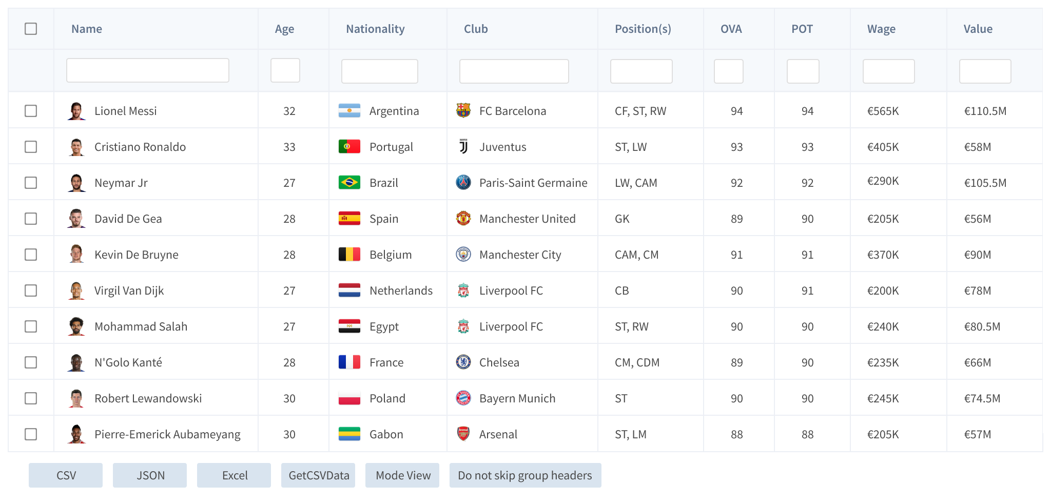
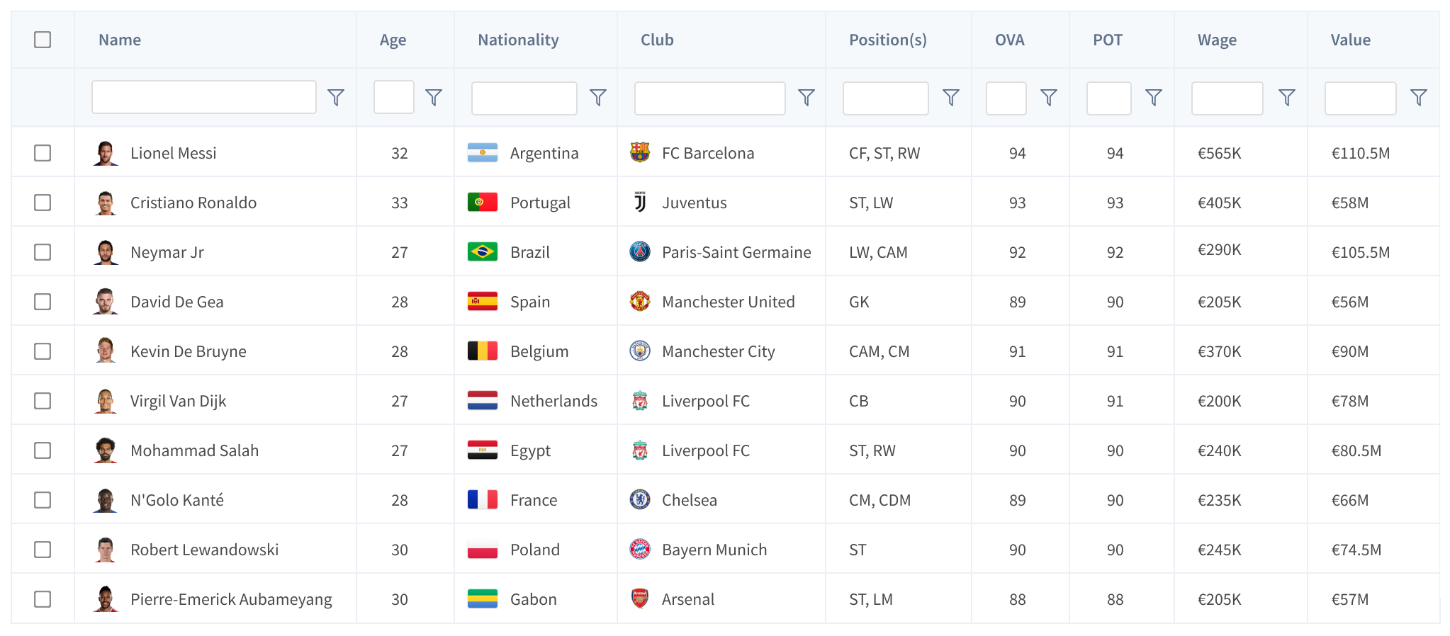
Grids: High-Performance Data Tables
Grids provide a high-performance data table component for large, complex datasets.
- Responsive grid with filtering, sorting and search
- Column grouping, nested headers and multi-row selection
- Export to CSV, JSON and Excel with real-time updates
Why FusionCharts
FusionCharts makes data accessible, beautiful, and actionable, helping teams transform complex
information into clarity and empower decisions.
Designed for developers. Trusted by enterprises.
Made with
FusionCharts
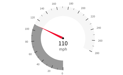
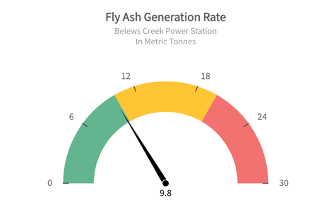
Speedometer
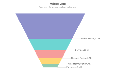
Simple funnel
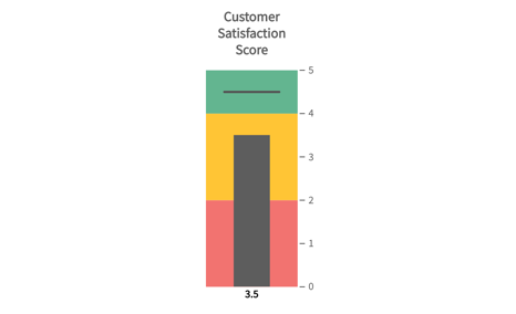
Vertical Bullet Graph
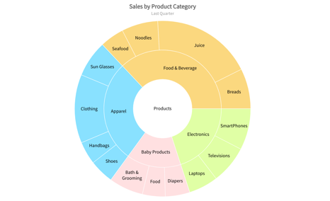
Nested pie in 2D
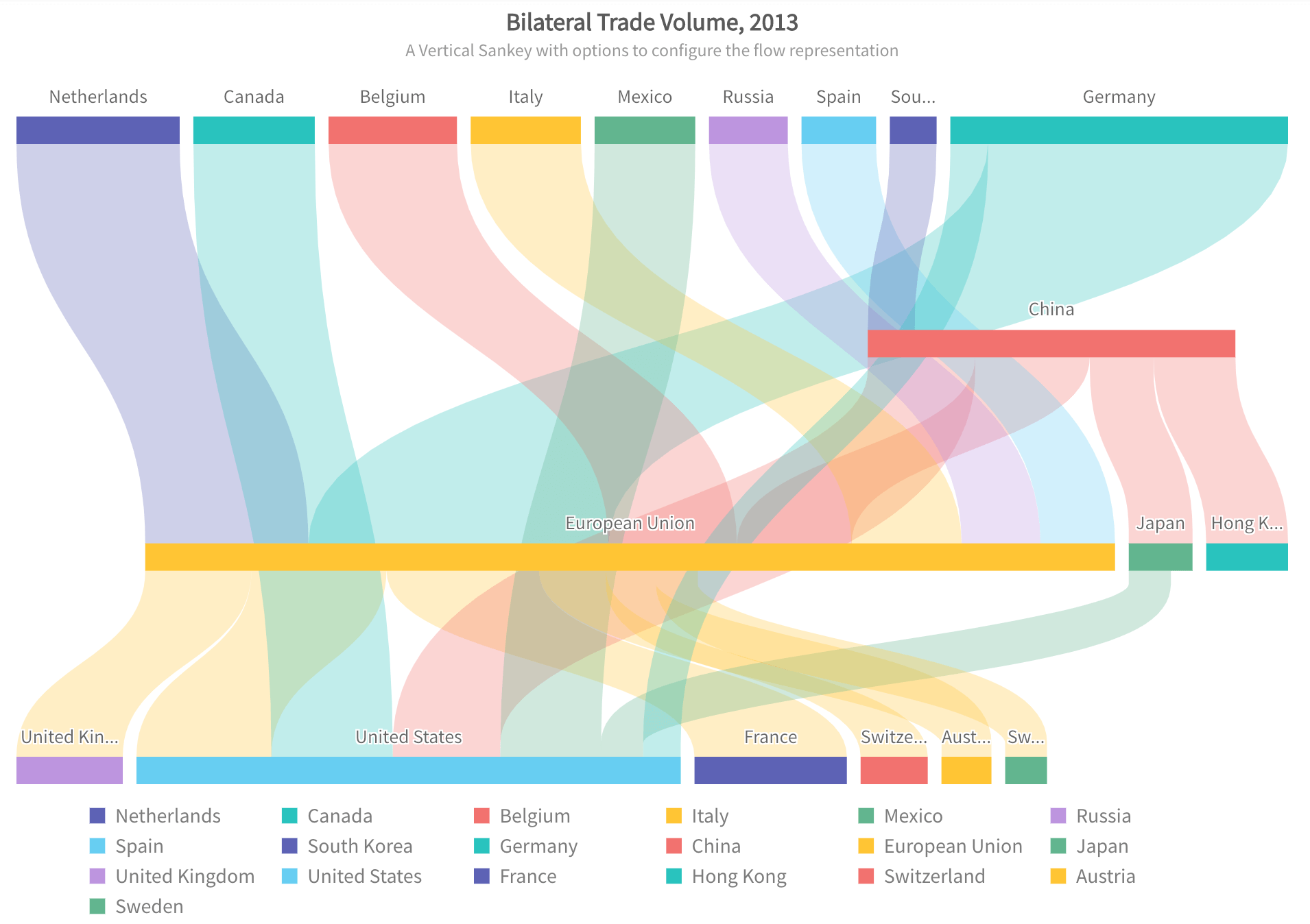
Vertical Sankey Diagram
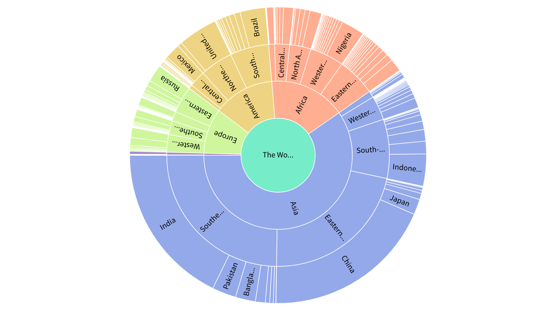
Simple Sunburst
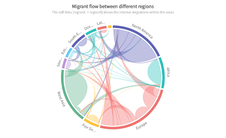
Chord with Self-links
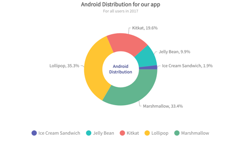
Donut in 2D
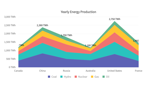
Stacked area
Marimekko Charts
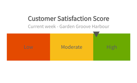
Linear Scale with colored categories
Real-time Angular
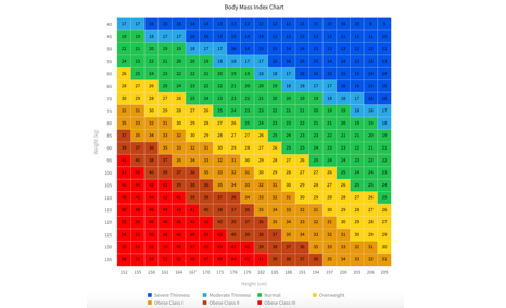
Heat map
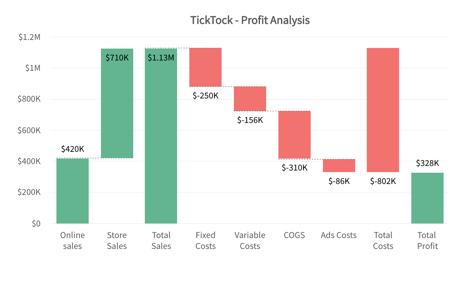
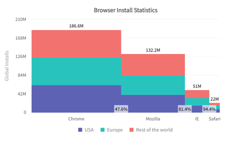
Simple waterfall
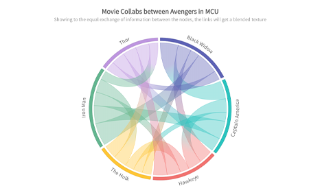
Simple Chord with Blend